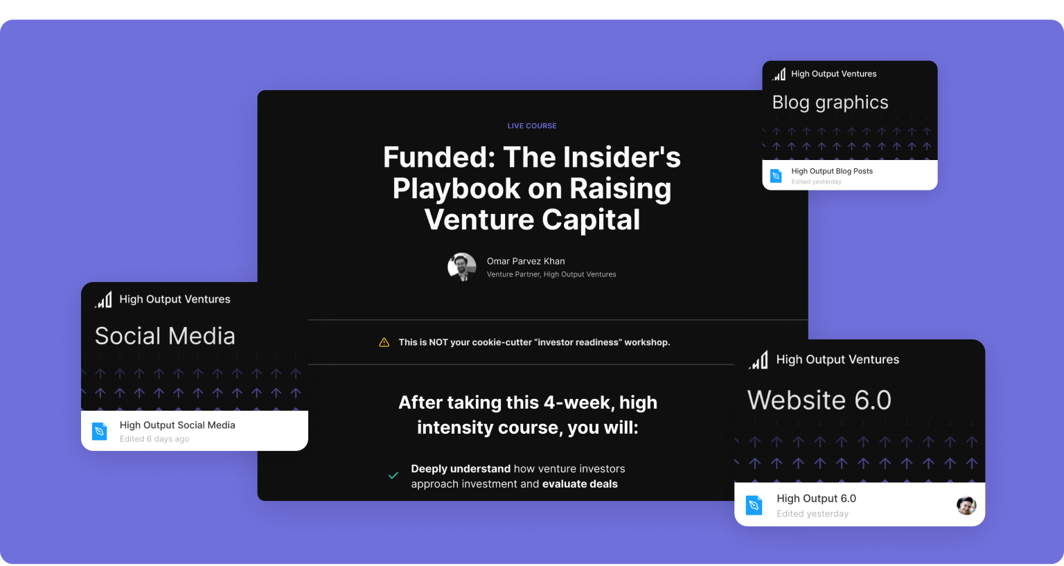
As HOV grew, I was in charge of making sure the company’s brand and website reflected who we are and what we’re trying to do.
The first few versions were just your standard agency websites. The real challenge came when we started to really grow. Here’s the situation:
- We were planning to start our startup accelerator aimed at Pakistan, so we wanted to build our presence there and attract the best local startups
- We wanted to define the look and feel of HOV’s brand and make it consistent across different touchpoints and channels
The brand and the website
Competitor accelerators and incubators mostly had outdated and cliche visuals: illustrations of rockets launching and “tiny people collaborating”. We wanted to contrast that: we’re confident, innovative people and bringing world-class experts and funding to Pakistani startups.
We’ve pulled inspiration from lots of places, like vintage science books and self-help pamphlets. I’ve experimented with lots of different ways to represent our concepts with simple geometric shapes.
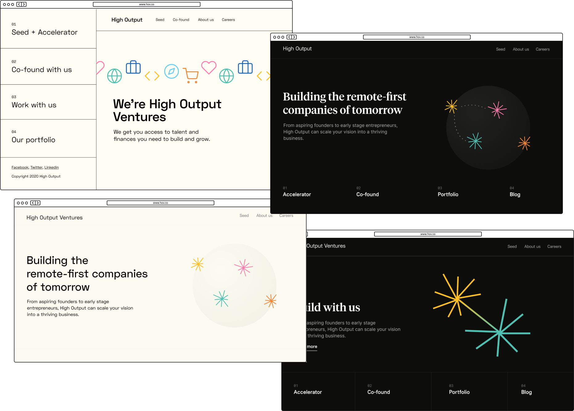
In the end, we’ve decided on an interesting direction: dark background, light text, and pastel icons arranged in patterns. I’ve designed everything from the website to social media graphics and business cards.
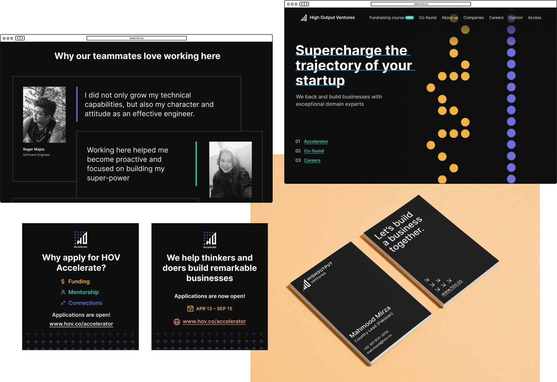
For some key components, we even animated the patterns to nudge visitors toward calls-to-action. Frontend devs really did a great job of making the animations smooth and performant.
Startup accelerator
Our CEO, Usman, wrote the copy for the landing page and it was my job to design it. He saw it as a long, hard-sell landing page, which would cover everything startups need to know about the program. I’ve played with the layout and added subtle animations in order to keep the visitor’s interest.
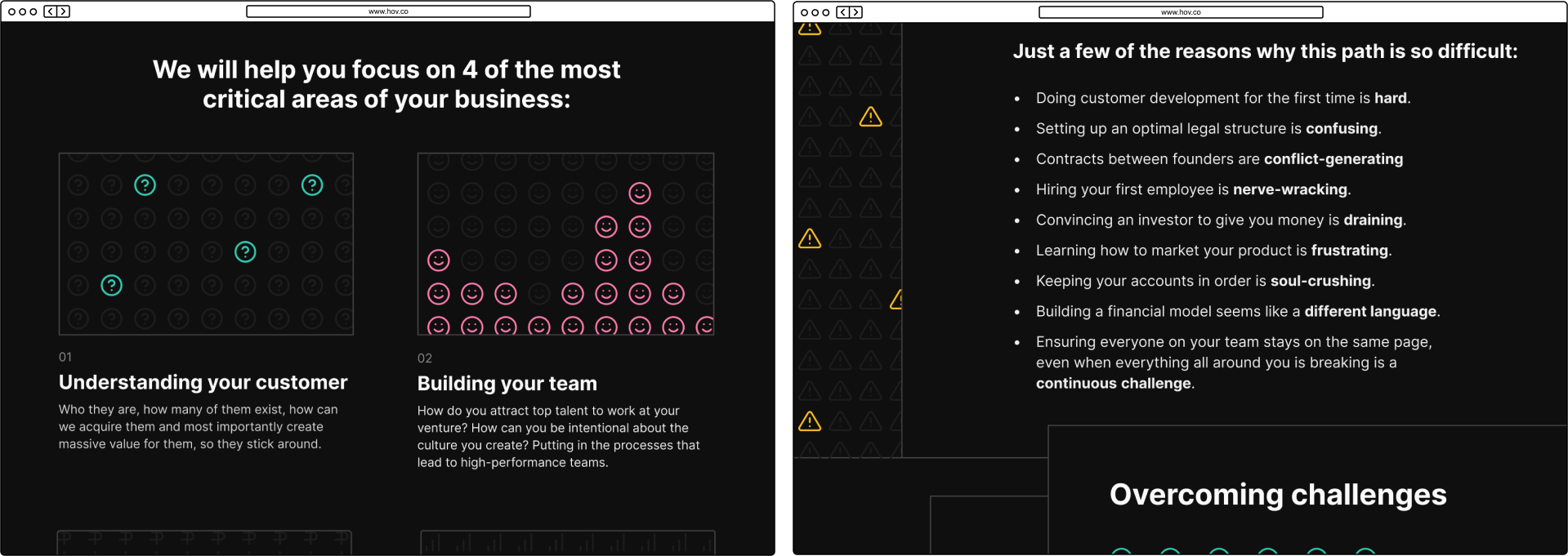
You can see the final version of the page here:
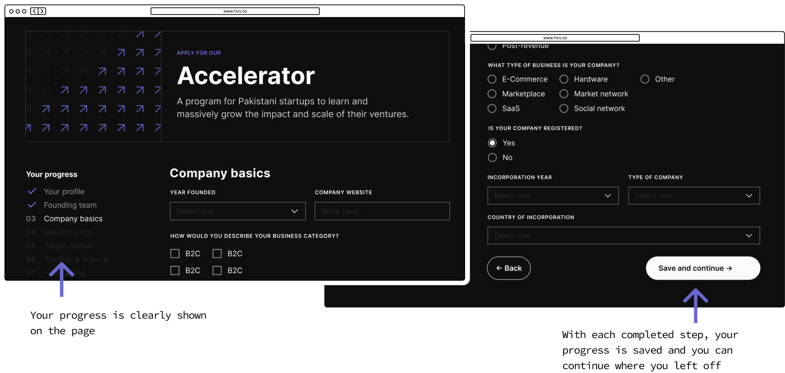
The next challenge was the application form. We needed to know a lot of information about each startup so we could filter them properly. We tried to make the experience as smooth as possible, splitting it into meaningful sections, giving the user a sense of progress… But there was just no way of getting around the fact that you can’t expect a user to fill the entire form in one go.
Making the user create an account just for this also didn’t really make sense, since it would add friction. So I worked with developers on creating a user-friendly solution: after you enter your email at the first step, we send you an email with a magic link you can use to continue where you left off. This worked out great and we saw most of the users get to the end once they started.
Outcomes and lessons
We’ve managed to make the headlines of all most important Pakistani tech news sources and over 100 startups applied for the accelerator. The response was overwhelmingly positive. From there, we were able to pick the best 3 for our intense accelerator program.
After the accelerator launched, the style guide and templates I’ve created made it a lot easier for other designers to create everything from social media graphics and company swag, to new landing pages and newsletters. It’s great seeing your work evolve and your teammates building on top of it!
The website was changed significantly since then, but you can still see a couple of pages I designed, such as HOV Accelerator landing page and HOV Funded course landing page.
👉 Next case study: Building HOV’s design department as Lead Designer

