Problem
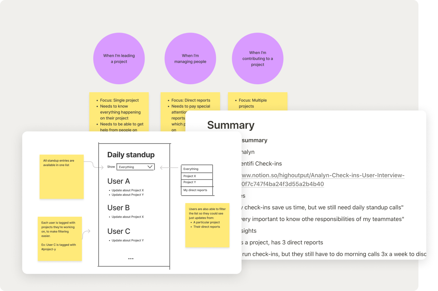
Identifi is HOV’s internal tool which helps as function as an async remote-first company through daily standups, mood trackers, sharing useful links and celebrating wins.
But the engagement and activation were low, even though the management was pushing the app pretty hard.
My goal was to try to figure out why people aren’t discovering and using features, and how to make those features more useful to them.
Research plan
The first thing I wanted to do is run user interviews. Most of the feature requests were coming from the people at the top, and my assumption was that the needs of a CEO and e.g. a junior developer are very different. Their voice just wasn’t getting heard.
I’ve scheduled interviews with a diverse group of teammates: different departments, different seniority, different timezones… and let them walk me through their workday. Some of the most useful tips for doing this were from The Mom Test and Talking to Humans, and I highly recommend them.
I combined this with a couple of surveys I ran and the data from Mixpanel. After that, I organized the insights to shine a light on the biggest problems, and added suggestions about how we would solve them.
Different needs
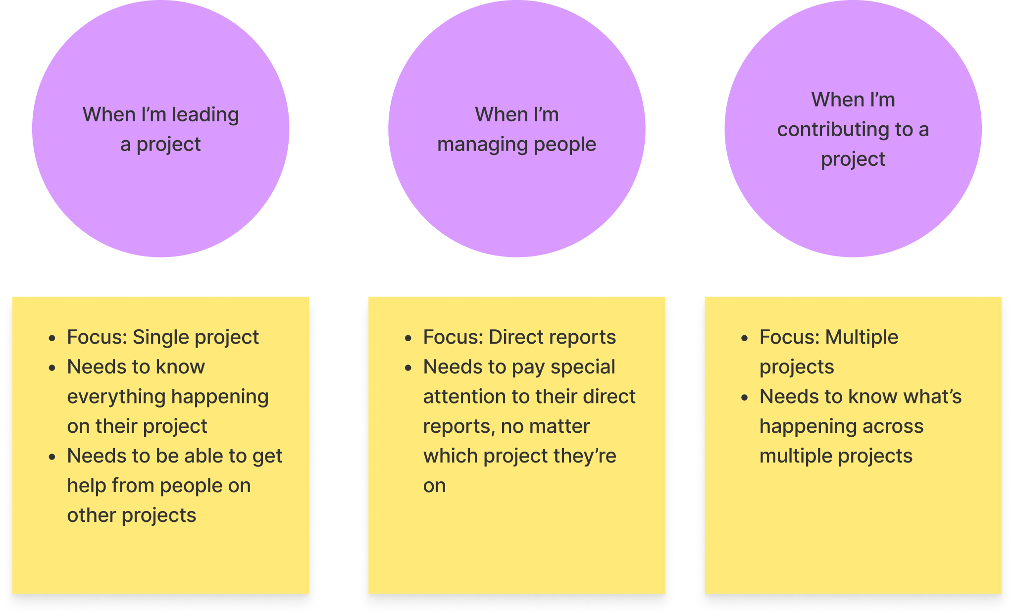
The first thing I noticed is that a couple of different personas (or jobs) started to crystalize: managers, project leads and individual contributors all had specific needs, which wasn’t reflected in the app. If we want to make the app useful to them, we have to pay attention to the different contexts and mental models they have.
Feature discovery
Users were mostly using the Slack integration and never bothered opening the web app, so they had no idea about which features existed. Sometimes they thought certain features are available only to admins.
💡 My suggestion: Bring onboarding to where they are. Use Slack bot to introduce a new feature every day, and promote rarely used features inside the ones they’re already using.
When mental models clash
The overall sentiment was that async daily standups were there just to please project leads: users didn’t get any value out of it, and they were running daily standup calls in addition to the async ones (98% of people according to a survey I ran!)
Digging deeper, I found out that there is a big disconnect between mental models used in the app and the ones users had.
The app took it for granted everybody worked on a single project, so that’s how standups were organized.
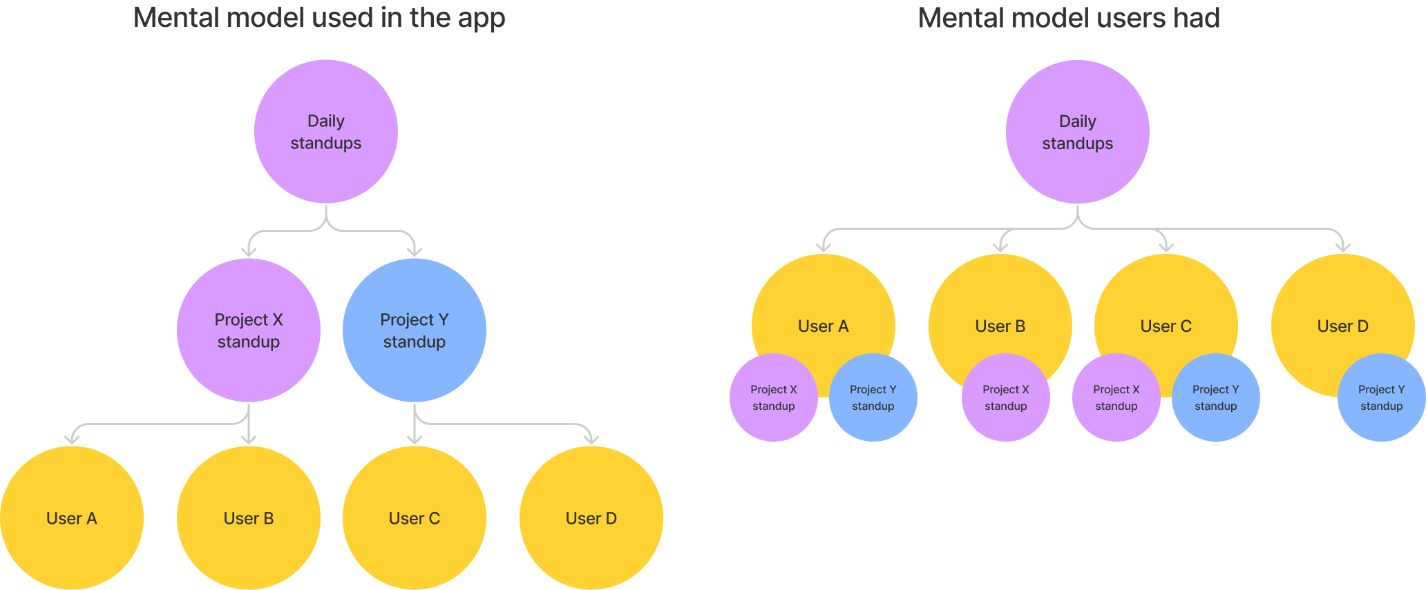
But it looked like most people were working on multiple projects at the same time. I ran a quick survey and found out 65% of people were working on at least two projects. If they wanted to find an update from one of their teammates, they had to first figure out what is their “main project”, and sometimes they couldn’t access that one… That added a lot of friction to collaboration.
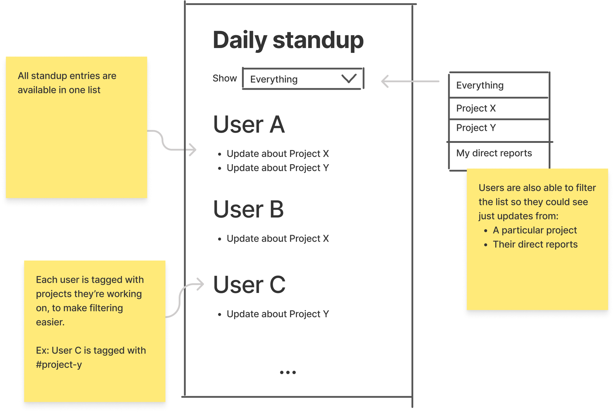
💡 My suggestion: Make the app reflect the mental model of the actual users and their reality by letting them:
- Access all daily standup entries
- Tag themselves with
- Filter the entries by project
Bringing the information to the user
The main part of Identifi was the newsfeed. It displayed everything happening at the company, with the ability to filter by type of activity. But it turned out that users were overwhelmed by this big stream of data. Not all content had the same importance and they had to actively search for what they want to see. So they just relied on Slack integrations. At least they didn’t have to open an additional app.
I’ve made a list of information that’s important to them and that they have to manually find every morning because it gives them context for that workday. Things like: how are my direct reports and teammates feeling today? Is anyone blocked today? Is anyone out of the office this week?
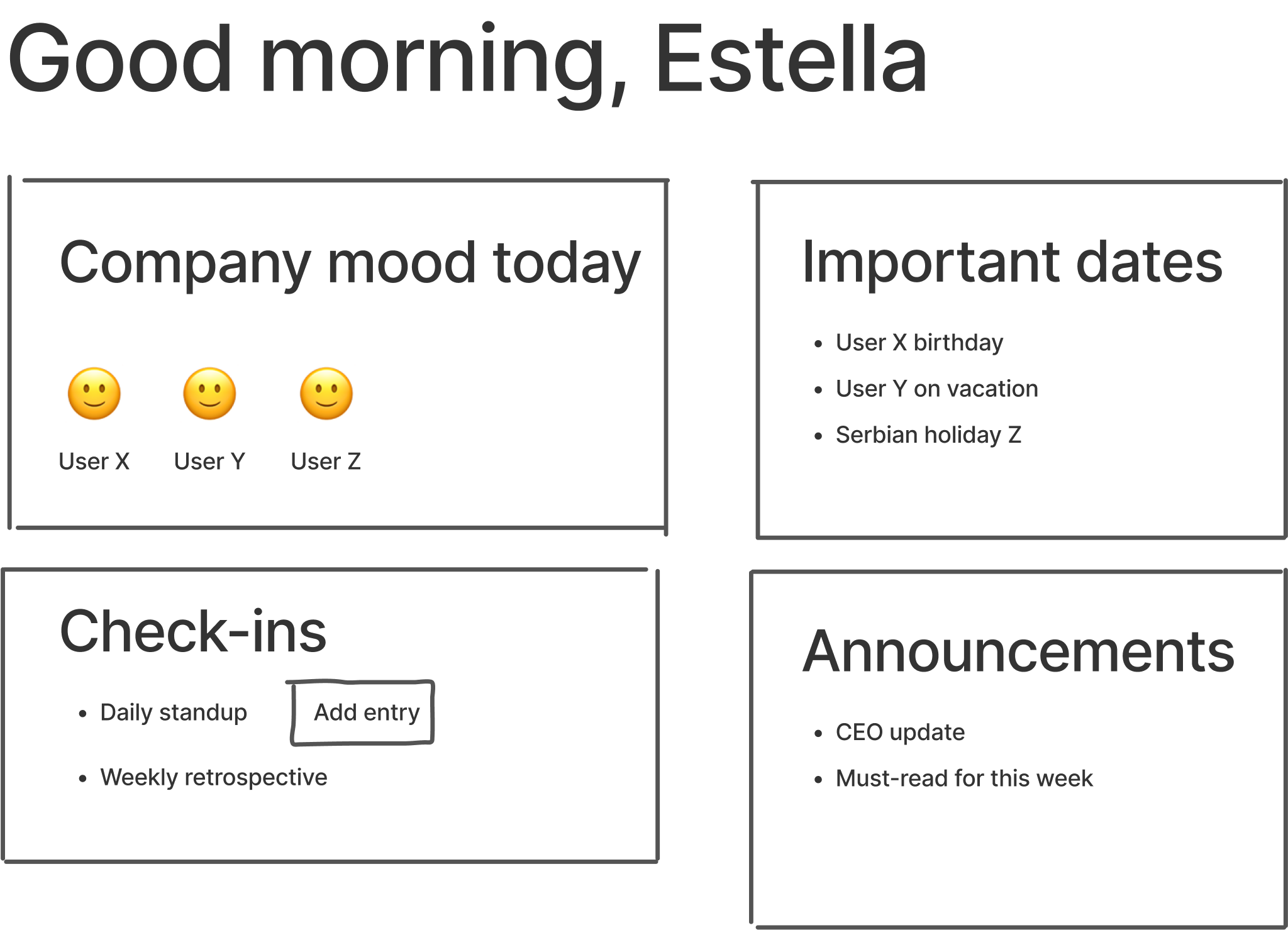
💡 My suggestion: Some sort of a dashboard or digest that would present relevant and timely information when they start their day.
Learnings & Outcomes
The research served as a foundation for changes Marko and Estella designed in the next few months.
- Gradual onboarding through Slack helped with activation, and gently nudging users to try less-used features brought the engagement up for that feature. In some cases, the boost was 120%.
- Opening up daily standup access allowed users to collaborate more and interact with each other inside the app
- Dashboard improved the experience for managers and project leads: it was obvious from engagements on certain features they’re now finding the information they need daily
Additionally, this experience helped me finally figure out a not-perfect-but-good-enough structure for organizing user research in Notion which we could reuse on all projects. It’s now a lot easier to make sure everyone on the team actually sees the results of the research. If you’d like to get access to these templates or just chat about it, feel free to reach out via email or Twitter!
👉 Next case study: Designing and evolving HOV's brand and website

