Overview
We worked with Tam Ging Wien, a seasoned REITs expert and educator, on helping people invest in REITs.
He was already running a successful series of seminars that helped people start investing, but there were a couple of issues:
- After the seminar, users were on their own. They would need to browse numerous blogs to gather data, use complicated Excel sheets to make calculations… It was intimidating.
- The model couldn’t scale. Wien’s seminars were constantly sold out, and unless he cloned himself it was physically impossible to scale it.
- There was a missed opportunity in the funnel. This obviously wasn’t the end of the funnel for his students, yet he was letting them go after that.
He came to us with an idea for a powerful tool that would solve all these problems: users could take courses, stay up to date with market changes and analyze wins and losses, all in one place.
We teamed up with Wien and worked closely with him to bring his vision to life. My job was everything design-related, from marketing to product.
- I’ve taken Wien’s data, rough ideas and sketches and turned them into user flows, wireframes and prototypes
- I’ve created a simple brand that would make all these moving parts feel like a cohesive and consistent experience
- I’ve designed a UI kit in Sketch, so we could quickly experiment and reiterate.

What’s worse than designing tables? Designing customizable, responsive tables 😅
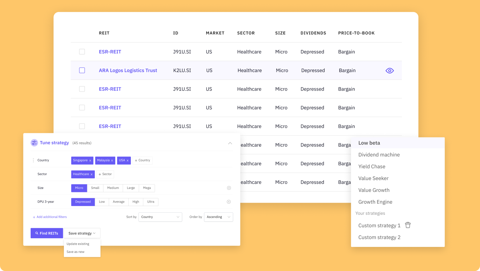
One big challenge was the REITs index table, the screener itself. Each entry had 30+ fields, which you can enable or disable, sort by or use to further filter data, depending on your strategy. And if you have a strategy that works for you, you want to save it for future use. That meant the table needs to be super-flexible and really fast.
I was lucky to work with amazing front-end devs. This is one of the things where spending time on mockups won’t get you anywhere. So we’ve spent hours together in Chrome Devtools together, experimenting and making sure everything works fast and looks good in 54784578 different states.

Personas
This worked for proficient users, but as time went by it was obvious that we’re limiting ourselves if we only focus on those who already know about REITs. So after more research and collecting data about people who sign up for REITScreener, it was clear that we have two different personas to cater to: newbies and pros. And if our funnel is trying to please both of those groups, newbies won’t get the support they need and pros will get annoyed.
The solution we went with was an onboarding questionnaire. A user would get through a couple of questions at the start which would help us figure out the best approach for them. Depending on their answers, they would get different tags that start a different email sequence in ActiveCampaign.

Simplifying the screener
That was a move in the right direction, but it wasn’t enough. We wanted to do another experiment: what if we built a separate tool just for newbies? If newbies don’t have enough knowledge or time to mess with complex strategies, let’s simplify it.
Following examples from companies such as Wealthfront, the user would go through our Investment Profile quiz which would help us figure out user’s priorities, age, expectations, risk tolerance… Based on that, we would calculate user’s investment profile and offer them an investment strategy that works for them.

The screener was also simplified. There is now a clear separation between two different mental models:
- Picking and tweaking a strategy
- Scanning and exploring the results

We worked at a fast pace, launching this within a month. I designed the onboarding and the screener, while my teammate Marko handled other screens like comparisons and settings, which are not shown here.
Lessons and outcomes
REITScreener is now a profitable product. It helped Wien scale his business beyond what he could have done with just seminars. And hundreds of users are still using it every day.
It was a great learning experience for me: I’ve learned a lot about designing super-complex responsive tables and charts.
Looking back, one thing I would do differently this time around is spending more time on research and shaping the MVP. We relied on existing research and data, and ended up overbuilding, and while we learned a lot of lessons along the way, those lessons were really expensive. We could have spent less time and money with user story mapping sessions and smaller experiments.
I’m no longer working on REITScreener (my fellow teammate Estella took over the design duties) but you can still see some of my work on REITScreener website
👉 Next case study: Helping teams collaborate remotely

