Background
Benjamin van Buren is a PhD student at Yale, studying the perception of animacy. He wanted a new personal website to showcase his work in a fun and approachable way.
Inspiration
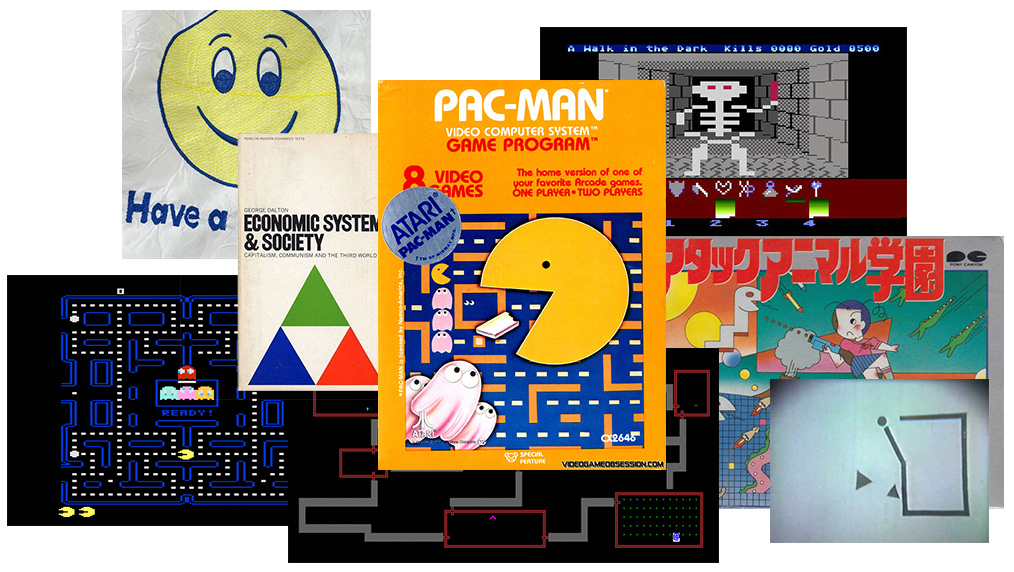
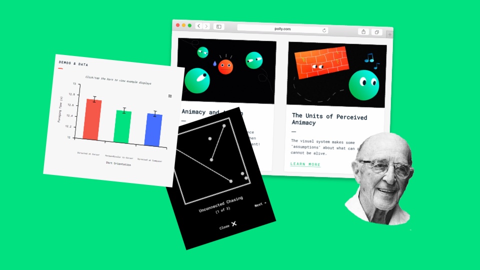
After diving into Ben’s research and some long chats with him, I learned that this amazing Heider and Simmel video inspired him to look into what makes humans assign emotions, motivations, and purpose to simple shapes and percieve them as alive. I also noted the use of lo-fi video games in his research, and how some of his findings are rather dark (your performance suffers even when you just think floating shapes are “looking” at you! 😰 ). We agreed that one way of making this website truly unique and personal is to include all of these themes—Heider & Simmel, old-school video games, vintage books and UIs—into its visual language.

Making the projects memorable
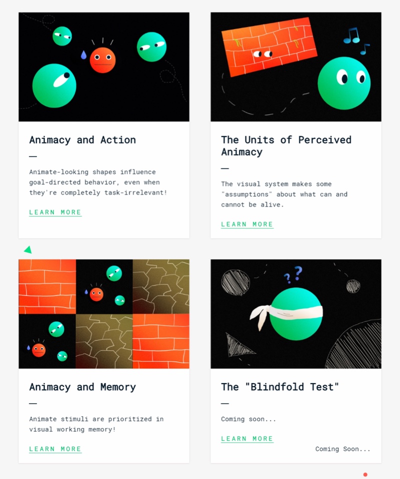
With this in mind, I started working on sketches for each project. The idea was to represent each of his papers with a “project card” that looks like something between a vintage science book and old video game box art, and illustrates the essence of each project. Lots of old video games didn’t show the actual gameplay on their box art; instead they opted for detailed illustrations, teasing you with what you’ll see when you dive into their world. That’s exactly what I tried to accomplish with these illustrations: to invite visitors to dive into his projects and learn more about stories around these odd little shapes.

Pretty Responsive Charts
Ben needed lots of charts to show the results of his experiments, but also a way to show the different conditions for each experiment. I accomplished this using Highcharts.js for creating customizable, responsive charts and making each bar activate a modal with HTML5 videos showcasing the experiment with different conditions. I prototyped the solution using Invision and then built it with Highcharts.js and Jquery.
50 Shades of Clickbait
While I was coding the website, we were constantly discussing and brainstorming the homepage. We needed something that would tell the visitors (or even better, show them) what’s Ben working on, ideally in less than 3 seconds. After numerous ideas, from straight-up-Buzzfeed “why a movie about triangles can move you more than a Mexican telenovela” to generic academic introductions, I found a way to both introduce Ben and let visitors directly experience his research.
Ben’s research on “Animacy & Action” uses a “wolfpack”—a bunch of disc shapes which float around the screen, constantly looking directly at your cursor and affecting your performance. I used those same shapes and made them follow the user’s cursor while they’re greeted with a provoking tagline:
Wrapping up
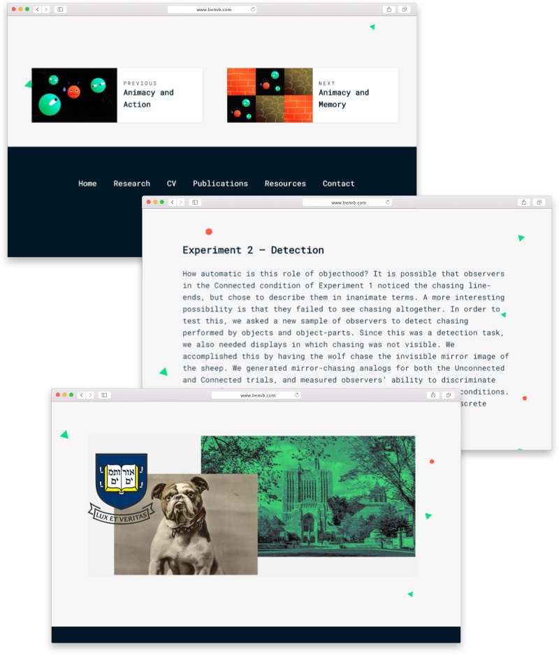
I used Roboto for headings and Roboto Mono for copy—they play nicely with geometric shapes while keeping everything friendly and approachable. Since Ben knows his way around HTML, I skipped using a CMS and just made sure my code is semantic, easy to read and properly commented. The website changed significantly since its launch, but you can check out my final version here.
“Djordje perfectly captured the feel of my research and he implemented it with tremendous enthusiasm, care and ingenuity.”


