Background
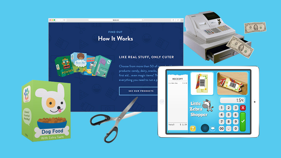
Back in 2012, Hans-Peter van Leeuwen came to me with an awesome idea. He wanted to make a simple, colorful app for kids that would allow them to run their own pretend-shop and use a smartphone or a tablet as a cash register. But the app itself would be just a part of the story. There would also be printable pretend-products, which kids can print out, assemble and scan using the app’s barcode scanner. My job was to work closely with Hans-Peter and his talented iOS developer @puckipedia and design the UI, dozens of printable pretend-products, and a marketing website.
“Cash register but for toddlers”
While there were numerous pretend-shop apps in the App Store at the time, most of them just used the supermarket theme as makeup for simple puzzle or math games. But with this app we wanted to tie different types of learning through playing into one cute package:
- Kids would learn how to use glue, paper scissors and their fingers to assemble printouts into pretend-products
- They would test and improve their arithmetic skills by calculating the change for their customers
- And finally, the app is just a tool here—the real fun comes from role-playing and socializing with their loyal customers i.e. friends and family
I tested various supermarket, cash register, barcode-scanner and education apps for kids, made notes about what works and what doesn’t, and started sketching. We needed something simple, ideally with all features on just one screen, but with enough space for chunky, colorful buttons, to make it easy for chubby baby-fingers. 👼
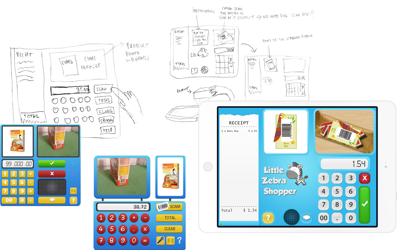
Since Hans-Peter was bootstrapping the product as a side-project born from his love for kids, there wasn’t a huge budget reserved for testing. That meant I had to hang out at the local mall and convince families with young kids to try out the app, recording their reactions, thoughts and questions (tip: malls are a great place for this, because people are usually relaxed and not in much of a hurry.) This gave us some valuable insight and helped us simplify the app even further—just one screen, simple icons and automatic scanning of products when you put them above your camera.
Products
For the release, I designed 20 different products from all kinds of categories. They were basically supermarket-staples as seen with the eyes of a 7-year-old kid, but we made sure to include healthy stuff too! The real challenge here was making them all feel like a part of the same cartoonish universe, but still with enough variety as if they’re produced by different companies. Yes, Nicky’s Candy Store really makes the best licorice and lollipops in Little Zebra Shopper universe, but they simply can’t compete with Super Fruity when it comes to cereals. #lore #universebuilding #overthinkingit
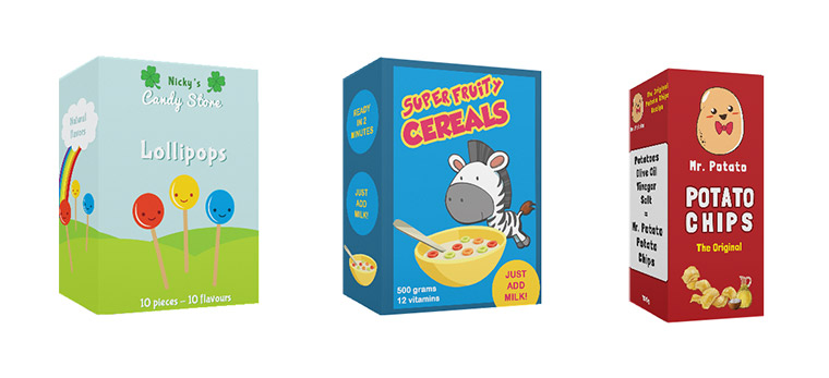
I also had to make sure they’re easy to print, cut out, fold and glue, even when parents aren’t around to help.
Website
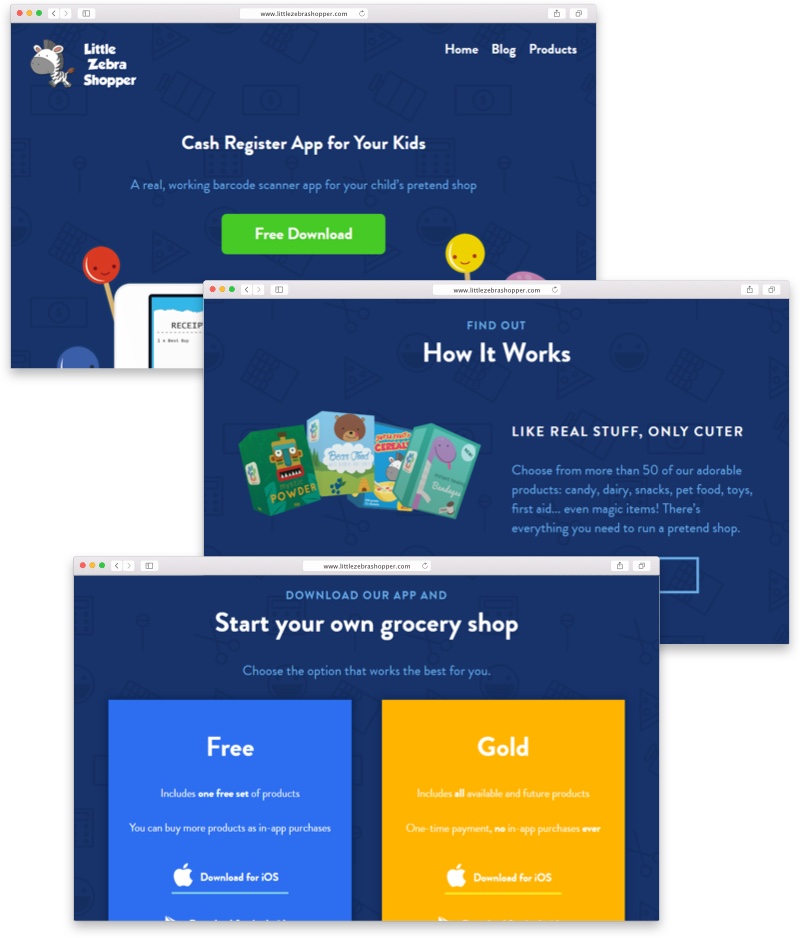
I also designed and built the Little Zebra Shopper website, which explains how the app works using simple language, pictures, videos and gifs. There is also a section where users can download new product packs to use with the app. The website is running on Wordpress, Timber and Advanced Custom Fields, making it easy for Hans-Peter to add new product sets and blog posts.
Updates
After amazing initial response (over 1000 downloads in a week!), we had a long list of improvements, feedback, wishes and demands…
First things first: it’s hard to keep afloat if you can’t get paid. So I designed official Little Zebra Shoper money and credit cards, which can be used to “pay” for products.
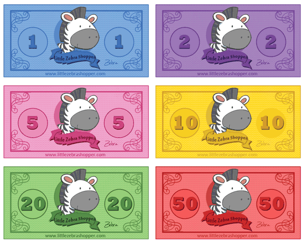
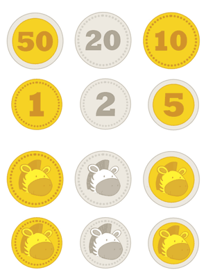
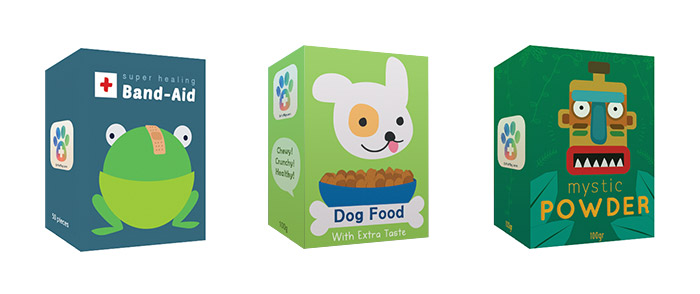
We also partnered with folks from Pretendasaurus and designed a special set of products for pets.
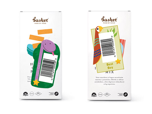
On popular request, we also added official Little Zebra Shopper barcode stickers, which you can add to any old regular product to add it to your pretend-shop.
Results
As of 2016, Little Zebra Shopper has:
- more than 200.000 downloads 🌍
- a 4-star average rating 💫
- recommendations from awesome blogs and app guides 👍
- mentions in talks and conferences 🎤
- been used in schools and museums 🎓

